Shogun: Modernizing responsive editing
Evolving a core product experience while maintaining backwards compatibility
Date: Nov 2024 – Mar 2025
My role: Staff Product Designer
Who I worked with: Director of Product, Director of Engineering, Engineering team
Reflection
This project reinforced how challenging it can be to evolve mature products that have accumulated years of customer content and established workflows.
While the goal was to modernize responsive editing, the real challenge was balancing progress with stability. Customers wanted an experience that felt more intuitive and aligned with modern tools, but they also depended on existing pages continuing to work exactly as expected.
One of the biggest lessons was the value of deep collaboration with engineering when tackling foundational platform changes. By validating concepts together early and often, we were able to move quickly, uncover edge cases before implementation, and avoid investing heavily in solutions that wouldn't be viable within the existing architecture.
Ultimately, the success of this project was measured by how uneventful the rollout felt. Customers were able to continue editing existing pages without compatibility issues, while quickly adopting a more modern and intuitive responsive editing experience. The absence of significant support requests validated the careful balance we had struck between innovation and stability.
The problem
Historically, Shogun treated each breakpoint as largely independent. Changes made on desktop did not automatically carry through to tablet or mobile, requiring merchants to repeatedly recreate edits across multiple views. While this approach provided flexibility, it increasingly conflicted with how users expected responsive design tools to behave.
The editing experience also made it difficult to understand how responsive settings were being applied. Users couldn’t always tell which breakpoints contained custom edits, visibility settings could be difficult to reason about, and previewing layouts was limited to a small number of predefined screen sizes.
At the same time, responsive editing was deeply embedded within Page Builder's architecture. Thousands of existing pages relied on the current behavior, and previous attempts to introduce cascading styles had created significant compatibility issues. The challenge wasn’t simply designing a better experience – it was finding a way to modernize a foundational workflow without disrupting existing customer content.
The opportunity
This project presented an opportunity to rethink responsive editing from the ground up while preserving the flexibility customers already depended on.
Overview
Responsive editing is a core part of any page-building experience, but over time Shogun's approach had begun to feel increasingly out of step with modern web design tools.
I led a cross-functional initiative to modernize responsive editing in Page Builder, introducing a more intuitive editing model and improved visibility into responsive behavior. Throughout the project, I worked closely with engineering to balance customer expectations, technical constraints, and the need to maintain backwards compatibility with existing pages – technically, this was a high-stakes, delicate project that would impact nearly every customer’s day-to-day experience in the product.
Our goals:
Reduce repetitive work and align the editing experience with modern responsive design patterns.
Help merchants better understand how responsive changes were being applied across breakpoints.
Give users more confidence in their designs by allowing them to preview layouts across a wider range of screen sizes.
Create a foundation for more advanced responsive capabilities – like responsive content – in the future.
Exploring solutions
Balancing modernization with backwards compatibility
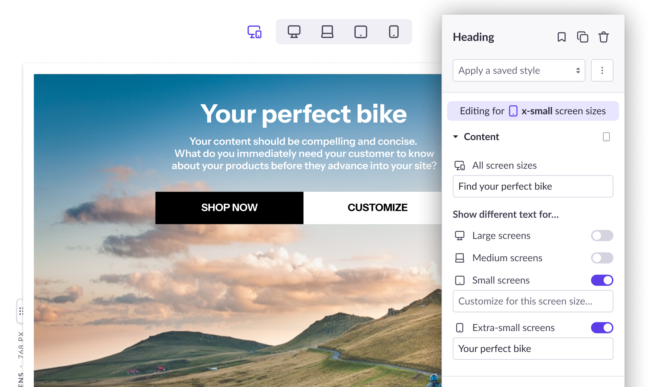
Because introducing true cascading styles would have meant that old pages would not be compatible with the updated editor, we settled on a hybrid approach: An “All screen sizes” option let customers apply styles quickly across all breakpoints, while individual device buttons allowed styles to be customized on a per-breakpoint level.
Visual indicators emphasize the selected breakpoint above the sidebar controls and show which elements have had styles edited at various breakpoints.
Controls to change breakpoints and adjust the canvas size.
Element visibility settings called out in the layout panel and next to the selected element name. In the sidebar, the toggles for turning on and off element visibility at various breakpoints.
Moving beyond fixed breakpoints
The Page Builder editor previously limited customers to previewing their pages at a small number of predefined screen sizes. To provide a more realistic view of how layouts behaved across devices, we introduced a resizable canvas that allowed customers to test designs across a continuous range of viewport widths.
This helped bridge the gap between editing and real-world usage, making it easier to identify layout issues that might otherwise go unnoticed until after publication.
Exploring responsive content
While responsive editing had traditionally focused on styling, we also explored opportunities to adapt content itself across different screen sizes.
These explorations included responsive images, breakpoint-specific content variations, and other approaches that would allow merchants to tailor experiences more effectively for different devices.
Some concepts moved forward while others remained exploratory, but the work helped establish a longer-term vision for the future of responsive design within Page Builder.
Shogun: Modernizing responsive editing
Evolving a core product experience while maintaining backwards compatibility
Date: Nov 2024 – Mar 2025
My role: Staff Product Designer
Who I worked with: Director of Product, Director of Engineering, Engineering team
Reflection
This project reinforced how challenging it can be to evolve mature products that have accumulated years of customer content and established workflows.
While the goal was to modernize responsive editing, the real challenge was balancing progress with stability. Customers wanted an experience that felt more intuitive and aligned with modern tools, but they also depended on existing pages continuing to work exactly as expected.
One of the biggest lessons was the value of deep collaboration with engineering when tackling foundational platform changes. By validating concepts together early and often, we were able to move quickly, uncover edge cases before implementation, and avoid investing heavily in solutions that wouldn't be viable within the existing architecture.
Ultimately, the success of this project was measured by how uneventful the rollout felt. Customers were able to continue editing existing pages without compatibility issues, while quickly adopting a more modern and intuitive responsive editing experience. The absence of significant support requests validated the careful balance we had struck between innovation and stability.
The problem
Historically, Shogun treated each breakpoint as largely independent. Changes made on desktop did not automatically carry through to tablet or mobile, requiring merchants to repeatedly recreate edits across multiple views. While this approach provided flexibility, it increasingly conflicted with how users expected responsive design tools to behave.
The editing experience also made it difficult to understand how responsive settings were being applied. Users couldn’t always tell which breakpoints contained custom edits, visibility settings could be difficult to reason about, and previewing layouts was limited to a small number of predefined screen sizes.
At the same time, responsive editing was deeply embedded within Page Builder's architecture. Thousands of existing pages relied on the current behavior, and previous attempts to introduce cascading styles had created significant compatibility issues. The challenge wasn’t simply designing a better experience – it was finding a way to modernize a foundational workflow without disrupting existing customer content.
The opportunity
This project presented an opportunity to rethink responsive editing from the ground up while preserving the flexibility customers already depended on.
Overview
Responsive editing is a core part of any page-building experience, but over time Shogun's approach had begun to feel increasingly out of step with modern web design tools.
I led a cross-functional initiative to modernize responsive editing in Page Builder, introducing a more intuitive editing model and improved visibility into responsive behavior. Throughout the project, I worked closely with engineering to balance customer expectations, technical constraints, and the need to maintain backwards compatibility with existing pages – technically, this was a high-stakes, delicate project that would impact nearly every customer’s day-to-day experience in the product.
Our goals:
Reduce repetitive work and align the editing experience with modern responsive design patterns.
Help merchants better understand how responsive changes were being applied across breakpoints.
Give users more confidence in their designs by allowing them to preview layouts across a wider range of screen sizes.
Create a foundation for more advanced responsive capabilities – like responsive content – in the future.
Exploring solutions
Balancing modernization with backwards compatibility
Because introducing true cascading styles would have meant that old pages would not be compatible with the updated editor, we settled on a hybrid approach: An “All screen sizes” option let customers apply styles quickly across all breakpoints, while individual device buttons allowed styles to be customized on a per-breakpoint level.
Visual indicators emphasize the selected breakpoint above the sidebar controls and show which elements have had styles edited at various breakpoints.
Controls to change breakpoints and adjust the canvas size.
Element visibility settings called out in the layout panel and next to the selected element name. In the sidebar, the toggles for turning on and off element visibility at various breakpoints.
Moving beyond fixed breakpoints
The Page Builder editor previously limited customers to previewing their pages at a small number of predefined screen sizes. To provide a more realistic view of how layouts behaved across devices, we introduced a resizable canvas that allowed customers to test designs across a continuous range of viewport widths.
This helped bridge the gap between editing and real-world usage, making it easier to identify layout issues that might otherwise go unnoticed until after publication.
Exploring responsive content
While responsive editing had traditionally focused on styling, we also explored opportunities to adapt content itself across different screen sizes.
These explorations included responsive images, breakpoint-specific content variations, and other approaches that would allow merchants to tailor experiences more effectively for different devices.
Some concepts moved forward while others remained exploratory, but the work helped establish a longer-term vision for the future of responsive design within Page Builder.
Shogun: Modernizing responsive editing
Evolving a core product experience while maintaining backwards compatibility
Date:
Nov 2024 – Mar 2025
My role:
Staff Product Designer
Who I worked with:
Director of Product, Director of Engineering, Engineering team
The problem
Historically, Shogun treated each breakpoint as largely independent. Changes made on desktop did not automatically carry through to tablet or mobile, requiring merchants to repeatedly recreate edits across multiple views. While this approach provided flexibility, it increasingly conflicted with how users expected responsive design tools to behave.
The editing experience also made it difficult to understand how responsive settings were being applied. Users couldn’t always tell which breakpoints contained custom edits, visibility settings could be difficult to reason about, and previewing layouts was limited to a small number of predefined screen sizes.
At the same time, responsive editing was deeply embedded within Page Builder's architecture. Thousands of existing pages relied on the current behavior, and previous attempts to introduce cascading styles had created significant compatibility issues. The challenge wasn’t simply designing a better experience – it was finding a way to modernize a foundational workflow without disrupting existing customer content.
The opportunity
This project presented an opportunity to rethink responsive editing from the ground up while preserving the flexibility customers already depended on.
Overview
Responsive editing is a core part of any page-building experience, but over time Shogun's approach had begun to feel increasingly out of step with modern web design tools.
I led a cross-functional initiative to modernize responsive editing in Page Builder, introducing a more intuitive editing model and improved visibility into responsive behavior. Throughout the project, I worked closely with engineering to balance customer expectations, technical constraints, and the need to maintain backwards compatibility with existing pages – technically, this was a high-stakes, delicate project that would impact nearly every customer’s day-to-day experience in the product.
Our goals:
Reduce repetitive work and align the editing experience with modern responsive design patterns.
Help merchants better understand how responsive changes were being applied across breakpoints.
Give users more confidence in their designs by allowing them to preview layouts across a wider range of screen sizes.
Create a foundation for more advanced responsive capabilities – like responsive content – in the future.
Exploring solutions
Balancing modernization with backwards compatibility
Because introducing true cascading styles would have meant that old pages would not be compatible with the updated editor, we settled on a hybrid approach: An “All screen sizes” option let customers apply styles quickly across all breakpoints, while individual device buttons allowed styles to be customized on a per-breakpoint level.
Visual indicators emphasize the selected breakpoint above the sidebar controls and show which elements have had styles edited at various breakpoints.
Controls to change breakpoints and adjust the canvas size.
Element visibility settings called out in the layout panel and next to the selected element name. In the sidebar, the toggles for turning on and off element visibility at various breakpoints.
Moving beyond fixed breakpoints
The Page Builder editor previously limited customers to previewing their pages at a small number of predefined screen sizes. To provide a more realistic view of how layouts behaved across devices, we introduced a resizable canvas that allowed customers to test designs across a continuous range of viewport widths.
This helped bridge the gap between editing and real-world usage, making it easier to identify layout issues that might otherwise go unnoticed until after publication.
Exploring responsive content
While responsive editing had traditionally focused on styling, we also explored opportunities to adapt content itself across different screen sizes.
These explorations included responsive images, breakpoint-specific content variations, and other approaches that would allow merchants to tailor experiences more effectively for different devices.
Some concepts moved forward while others remained exploratory, but the work helped establish a longer-term vision for the future of responsive design within Page Builder.
Reflection
This project reinforced how challenging it can be to evolve mature products that have accumulated years of customer content and established workflows.
While the goal was to modernize responsive editing, the real challenge was balancing progress with stability. Customers wanted an experience that felt more intuitive and aligned with modern tools, but they also depended on existing pages continuing to work exactly as expected.
One of the biggest lessons was the value of deep collaboration with engineering when tackling foundational platform changes. By validating concepts together early and often, we were able to move quickly, uncover edge cases before implementation, and avoid investing heavily in solutions that wouldn't be viable within the existing architecture.
Ultimately, the success of this project was measured by how uneventful the rollout felt. Customers were able to continue editing existing pages without compatibility issues, while quickly adopting a more modern and intuitive responsive editing experience. The absence of significant support requests validated the careful balance we had struck between innovation and stability.